Terms
-
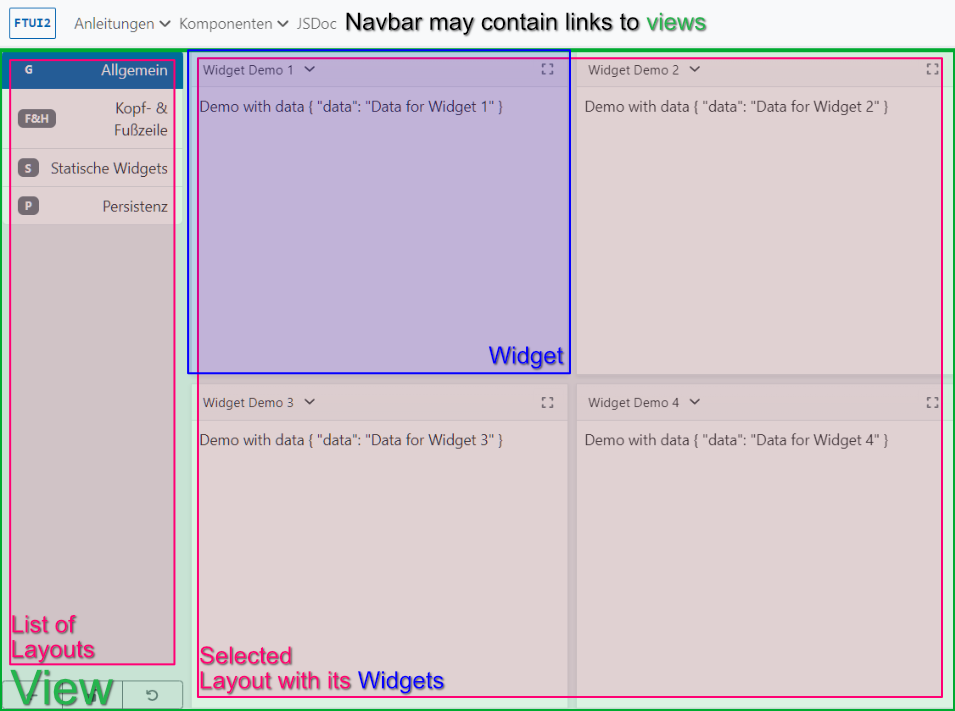
A View covers most of the viewport, safe for the navigation bar.
-
A View holds a list of Layouts.
-
The interaction element itself with all its extra features is called a Dashboard.
-
-
A Layout defines an arrangement of one or more Widgets.
-
A Widget is a movable and resizable container holding a Component.
Define a View
//...

const someView: ViewConfig = [{
  name: 'common.firstLayout',
  segment: 'firstLayout',
  icon: 'star',
  layout: [{
    id: 1,
    component: SomeComponent,
    name: "common.someName",
    x: 0,
    y: 0,
    width: 12,
    height: 12,
    draw: true
  }]
}, {
  name: 'common.secondLayout',
  segment: 'secondLayout',
  icon: 'bell',
  layout: [{
    id: 1,
    component: AnotherComponent,
    name: "common.someOtherName",
    x: 0,
    y: 0,
    width: 12,
    height: 12,
    draw: true
  }]
}];

const routes: Routes = [
    {
        path: 'somePath/:layout', component: FtuiView, data: {
            view: someView,
            dashboardOptions: {rows: 12, columns: 12}
        }
    }
}
Define a Widget
@Component({
    selector: 'app-demo-widget-component',
    templateUrl: './demoWidget.component.html',
})
export class DemoWidgetComponent extends WidgetComponent {

}<div #header>
<div class="btn-group">
<button ftui-button>app.demoWidget.aButtonLabel</button>
<button ftui-button>app.demoWidget.anotherButtonLabel</button>
</div>
</header>
<div class="p-2">
Demo Widget Content
</div>
<div #footer>
<div class="btn-group">
<button ftui-button>app.demoWidget.footerButtonLabel</button>
</div>
</header> The #header and #footer template variables allow the WidgetComponent to inject the template code into the header / footer row of the widget.
Provide parameters to widget Components
When defining a widget with a Component we cannot use Inputs like in Angular templates.
const someView: ViewConfig = [{
  name: 'common.firstLayout',
  segment: 'firstLayout',
  icon: 'star',
  layout: [{
    id: 1,
    component: SomeComponent,
    name: "common.someName",
    x: 0,
    y: 0,
    width: 12,
    height: 12,
    params: {someAPIdata: 42},
    draw: true
  }]
}];
There are two ways to access input parameters in the widget Component’s controller, via injection and via inheritance.
Injection
These are available at construction time.
type params = {someAPIdata: number};
@Component({
    // ...
})
export class SomeComponent extends WidgetComponent {
  // ...
  constructor(@Inject(PARAMS) private params: params) {
    this.someAPIdata = this.params.someAPIdata;
  }
}
Inherited properties
These are only available in the AfterViewInit lifecycle hook.
@Component({
    // ...
})
export class SomeComponent extends WidgetComponent {
  // ...
  AfterViewInit() {
    super.ngAfterViewInit();
    this.someAPIdata = this.config?.params['someAPIdata']
  }
}
Persist widget config
The dashboard will persist widget changes like position, size, and visibility. But sometimes the widget itself would like to change something about their config. For example, a widget needs a resource ID (params: {resourceId: ?}) but is only provided with one after an API call. You’ll need to call something like this.setWidgetConfig({ params: { resourceId: 42 } });
Make widgets responsive
We can use CSS' Media Queries or Bootstrap’s col-* classes to make content responsive depending on the viewport size. Widgets (and windows) can be resized by the user, and therefore may need a way to adjust their content based on the parent’s width. Use ftuiResponsive and ftuiBreakpoints for that.
        <div class="container-fluid" ftuiResponsive>
            <div class="row">
                <div [ftuiBreakpoints]="{'col-12': 0, 'col-6': 300, 'col-4': 600}">
                    ...
                </div>
                <div [ftuiBreakpoints]="{'col-12': 0, 'col-6': 300, 'col-4': 600}">
                    ...
                </div>
                <div [ftuiBreakpoints]="{'col-12': 0, 'col-4 col-md-6': 600}">
                    ...
                </div>
            </div>
        </div>
The provided breakpoints object works the following way:
{
    'col-12': 0, // when the parent's width is higher than 0 (but lower than the next breakpoint of 300), add the class col-12
    'col-6': 300, // when the parent's width is higher than 300 (but lower than the next breakpoint of 600), add the class col-6
    'col-4 col-xl-2': 600,  // when the parent's width is higher than 600, add the classes col-4 and col-xl-2
}