A popover provides contextual information on elements that do not break the flow of the layout and need minimal interaction to show and hide them. They are sometimes also called tooltips. They are often used as tooltips, e.g. a few words on the functionality of a button, or a hotkey.
Simple tooltip with String input
A simple string or i18n key with line breaks can be passed to the directive.
<button
  ftui-button
  icon="search"
  ftuiPopover="I'm a useful tooltip from \n an inline string.">
  Hover me
</button>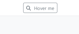
Reactive tooltip with Template input
Alternatively a template can be passed.
<button
  ftui-button
  icon="search"
  [ftuiPopover]="tooltipContent">
  Hover me
</button>
<ng-template #tooltipContentSimple let-index="index">
  <ftui-popover-wrapper>I'm a useful tooltip <br/><em>from a template!</em>
    <div class="border border-light rounded my-2">
      It's {{currentTime|async|dfnsFormat: 'HH:mm:ss'}}
    </div>
  </ftui-popover-wrapper>
</ng-template>
Dynamic tooltip with Template and context
Sometimes you’ll need more contextual awareness, for example if the anchor elements are programmatically generated with *ngFor but you want to write the template only once.
<button
  *ngFor="let index of [0,1,2,3,4]"
  ftui-button
  icon="search"
  [ftuiPopover]="tooltipContent"
  [popoverContext]="{buttonIndex: index}">
  Button No {{index}}
</button>
<ng-template #tooltipContent let-buttonIndex="buttonIndex">
  <ftui-popover-wrapper>
    I'm a useful tooltip <br/>
    <em>from a template for button {{index}}!</em>
  </ftui-popover-wrapper>
</ng-template>
Popover and disabled elements
Elements with the disabled attribute set will not trigger cursor events, therefore Popovers won’t work.
Wrap them in a not-disabled DIV.
<div ftuiPopover="I'm a useful tooltip from \n an inline string.">
    <button
            ftui-button
            [disabled]="true"
            icon="search">
        Hover me
    </button>
</div>
Popover in the Grid
The Grid has built-in support for Popovers. See the documentation.