Use the ftuiValidate directive to automatically apply Bootstrap’s is-invalid class when Angular’s FormGroup marks a control invalid.
Standard feedback messages
Simply add the ftuiValidate directive and set the required validator. The value of the error key that is set by the validator is used as an i18n key for the feedback message, the error key is used in a style class name. For example, if the validator returns {tooShort: 'app.errors.tooShort'}, 'app.errors.tooShort' will be processed by the translate service (it will not if the value is boolean), and error-tooShort is assigned to the input element.
The required attribute on the HTML element would also work, useful in conjunction with [(ngModel)].
|
The asterisk * will be automatically appended to the label if the for and id attributes are correctly set.
|
<form [formGroup]="userForm">
    <div class="mb-2">
        <label
            for="nameInput"
            class="form-label mb-0"
            translate>app.name.label</label>
        <input
            ftuiValidate
            id="nameInput"
            class="form-control-sm form-control"
            [placeholder]="'users.name.placeholder'|translate"
            formControlName="name" />
    </div>
</form>protected userForm: FormGroup;
constructor() {
this.userForm = new FormGroup({
name: new FormControl<string | null>(null, [Validators.required]),
});
}Optionally, import custom styles. Otherwise, Bootstrap’s styles are used. You can also
define your own styles, the global class that gets assigned to feedback messages is invalid-feedback.
@use "@felixt/ftui2/styles/ftui-validate";

/* OR */

.invalid-feedback {
    width: auto;
    position: absolute;
    background-color: var(--bs-white);
    z-index: 1000;
    border: 1px solid var(--bs-border-color);
    border-radius: var(--bs-border-radius);
    padding: 0.5rem;
    box-shadow: var(--bs-box-shadow);
}
Style via providing a container element
By default, ftuiValidate creates a container element to put the feedback messages into. Alternatively, you
can provide a container from the template.
<form [formGroup]="userForm">
    <div class="mb-2">
        <label
            for="nameInput"
            class="form-label mb-0"
            translate>app.name.label</label>
        <input
            ftuiValidate
            id="nameInput"
            class="form-control-sm form-control"
            formControlName="name"
            [placeholder]="'users.name.placeholder'|translate"
            [ftuiValidateFeedbackContainer]="feedbackContainer" />
    </div>
</form>

<div #feedbackContainer
      class="invalid-feedback bg-warning-subtle p-2 rounded shadow">
</div>
Custom feedback messages
By setting [ftuiValidateDefaultFeedback] to false, the directive will not append any default containers, but it will still assign corresponding classes (like error-{error key}) so you can control the display of feedback messages via CSS.
For example, if the validator returns {tooShort: true}, error-tooShort is assigned to the input element.
<form [formGroup]="userForm">
    <div class="mb-2">
        <label
            for="nameInput"
            class="form-label mb-0"
            translate>app.name.label</label>
        <input
            ftuiValidate
            id="nameInput"
            class="form-control-sm form-control"
            formControlName="name"
            [placeholder]="'users.name.placeholder'|translate"
            [ftuiValidateDefaultFeedback]="false" />
    </div>

    <div class="custom-too-short-feedback" translate>
        app.error.tooShort
    </div>

    <div class="custom-not-unique-feedback" translate>
        app.error.notUnique
    </div>
</form>form {
.is-invalid.error-tooShort ~ .invalid-feedback > .custom-too-short-feedback,
.is-invalid.error-notUnique ~ .invalid-feedback > .custom-not-unique-feedback {
display: block!important;
}
}
.custom-too-short-feedback, .custom-not-unique-feedback {
display: none;
}Define form-wide validators
Sometimes, validation requires context from other form fields as well.
Form-wide validators set the INVALID flags on the form itself, and not on any specific form control by default.
This prevents the user from submitting an invalid form, but the ftuiValidate directive has no way of knowing if the parent form is valid or not.
The example below checks if a short name is unique within entries that do not share the same ID, and
then returns a ValidationErrors object, as well as sets the error on the relevant form control.
static uniqueShortName(getList: (() => SomeModel[])): ValidatorFn {
return (control: AbstractControl<SomeModel>): ValidationErrors | null => {
const formGroup: FormGroup<SomeModel> = control as FormGroup;
const shortName = () => formGroup.value.shortName;
const id = () => formGroup.value?.id;
if (!shortName()) {
return null;
}
const isNotUnique = getList().some(entry => {
return entry.shortName === shortName() && entry.id !== id()
})
if (isNotUnique) {
formGroup.controls['shortName']?.setErrors({isUniqueShortName: 'app.validation.uniqueShortname'})
return {isUniqueShortName: 'app.validation.uniqueShortname'}
}
return null
}
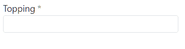
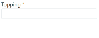
}Show valid feedback
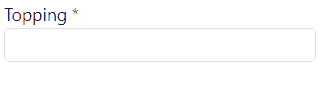
By default, validated and valid inputs won’t receive extra styling. You can enable default styling by setting [ftuiValidateShowValid] to true.
<form [formGroup]="pizzaForm">
    <div class="mb-2">
        <label
            for="toppingInput"
            class="form-label mb-0"
            translate>app.topping.label</label>
        <input
            ftuiValidate
            id="nameInput"
            class="form-control-sm form-control"
            formControlName="topping"
            [placeholder]="'app.topping.placeholder'|translate"
            [ftuiValidateShowValid]="true" />
    </div>

    <div class="valid-feedback" translate>
        app.common.ok
    </div>
</form>